The theme ships with 7 named color schemes that replace the primary accent color across every component — links, buttons, tags, progress bars, focus rings, and skill bars — in both light and dark modes. No SCSS knowledge required.
If you have the live switcher enabled, you can try all the schemes right here in this post:
The 7 built-in schemes
Each scheme defines two hex values: a primary color for light mode and a brighter variant for dark mode (to maintain readability on dark backgrounds).
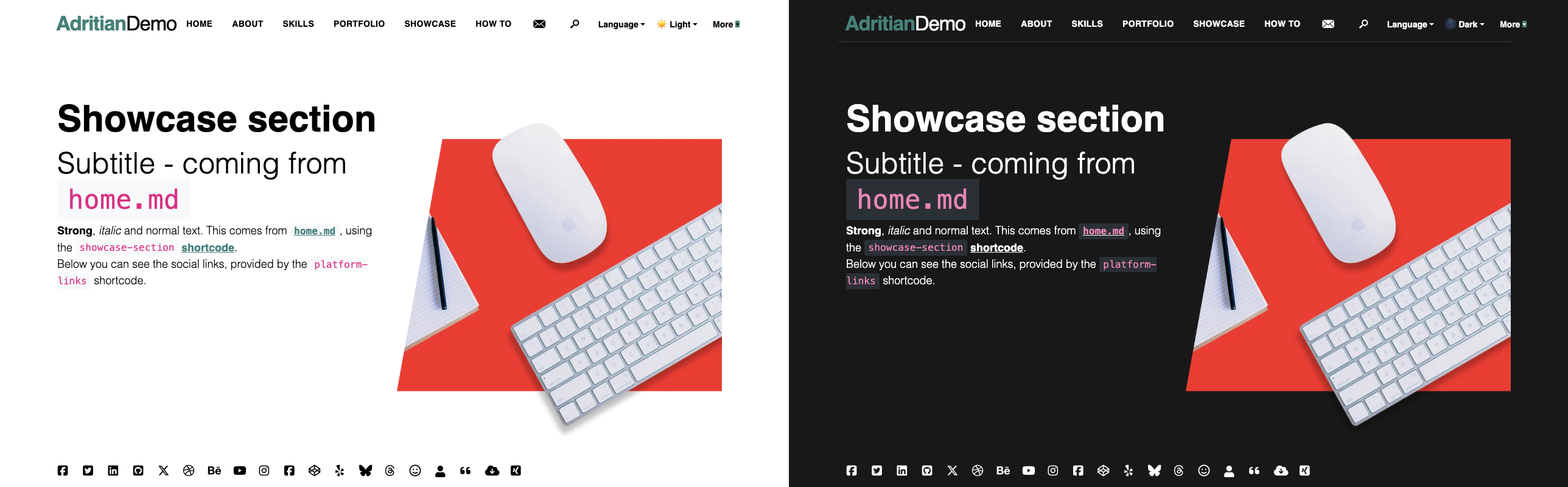
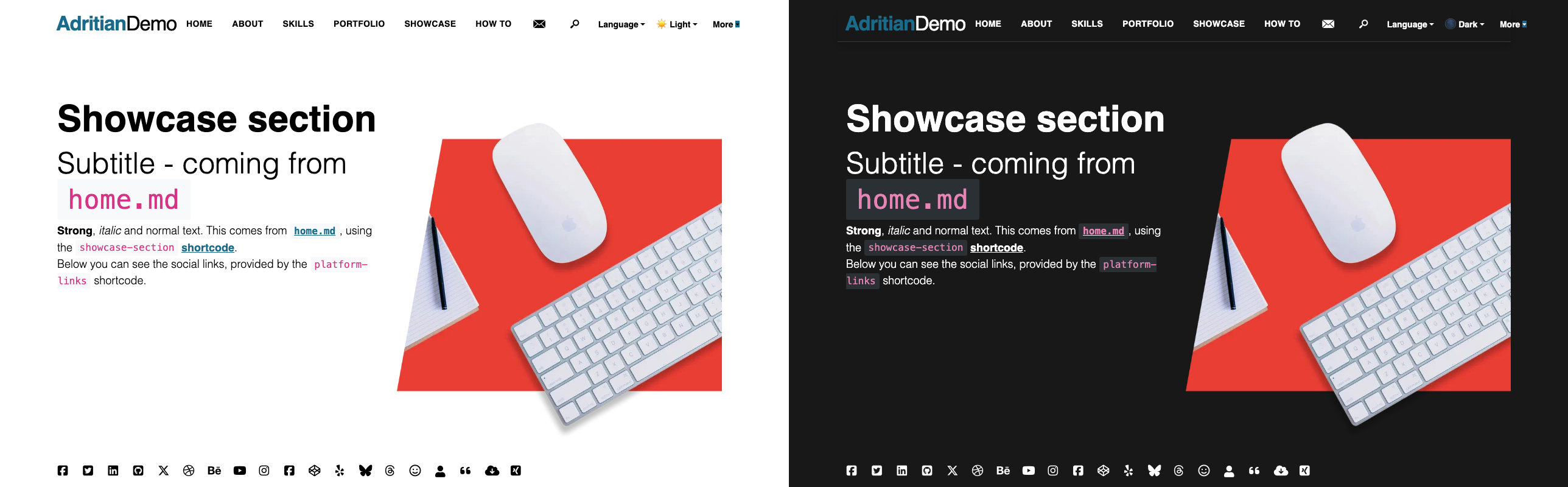
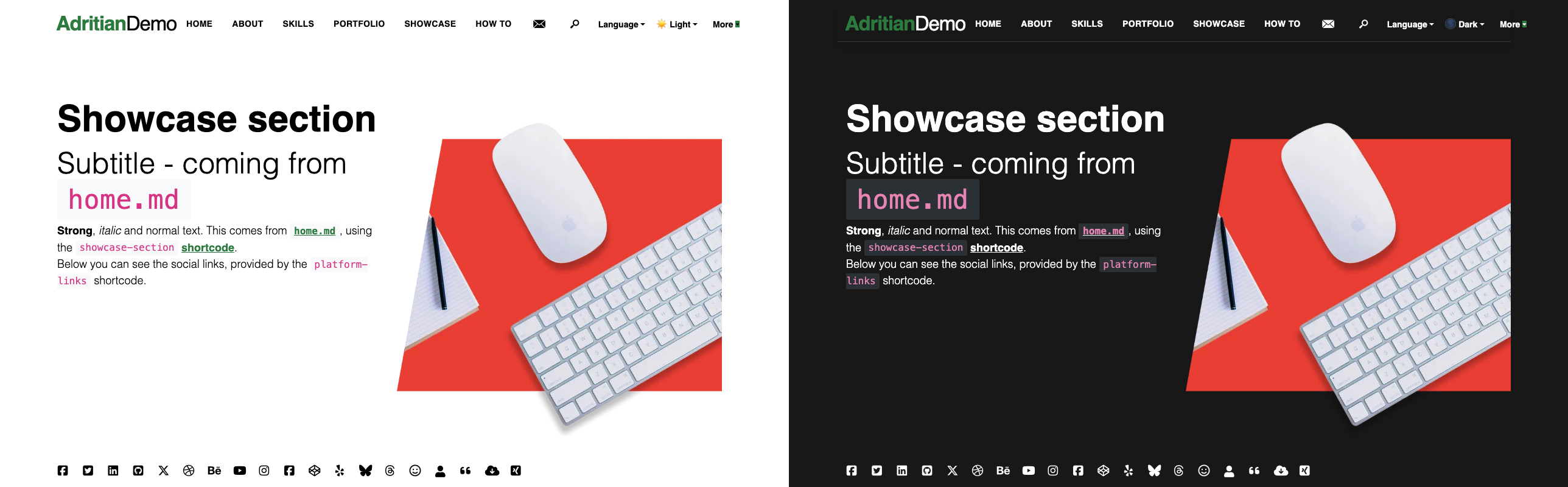
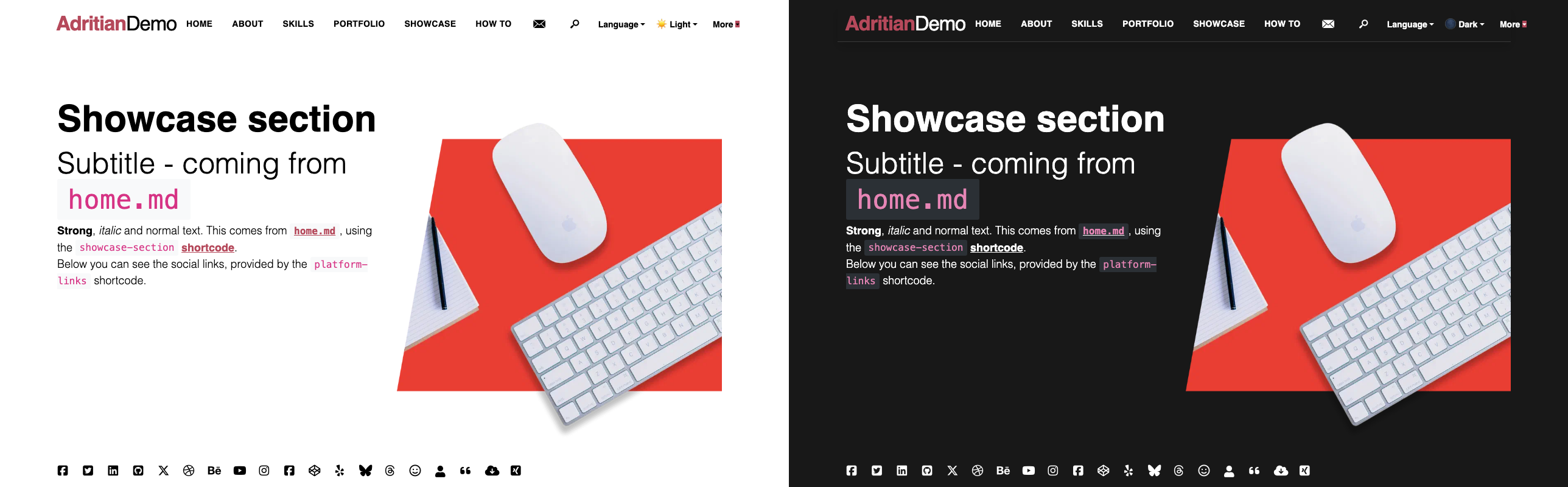
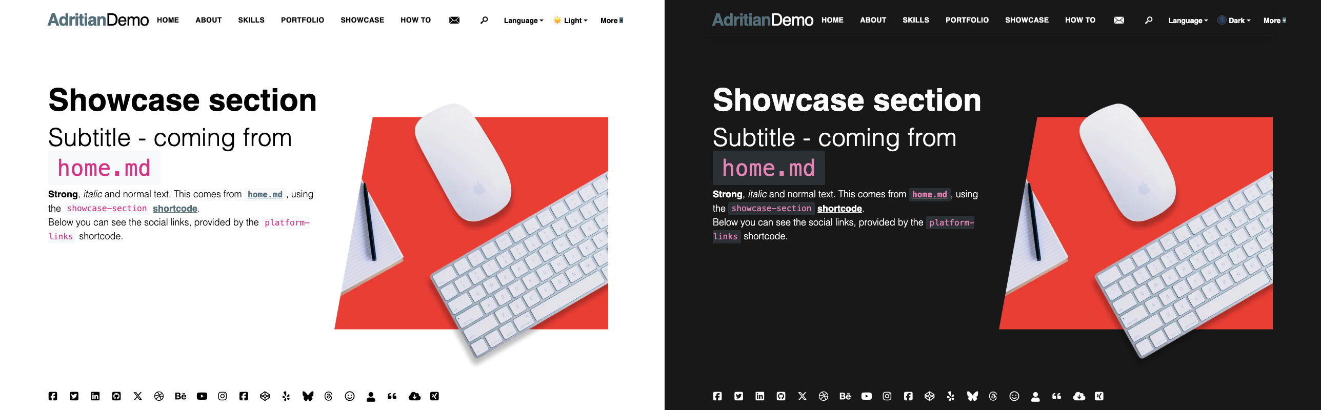
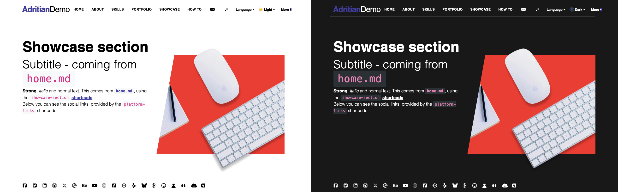
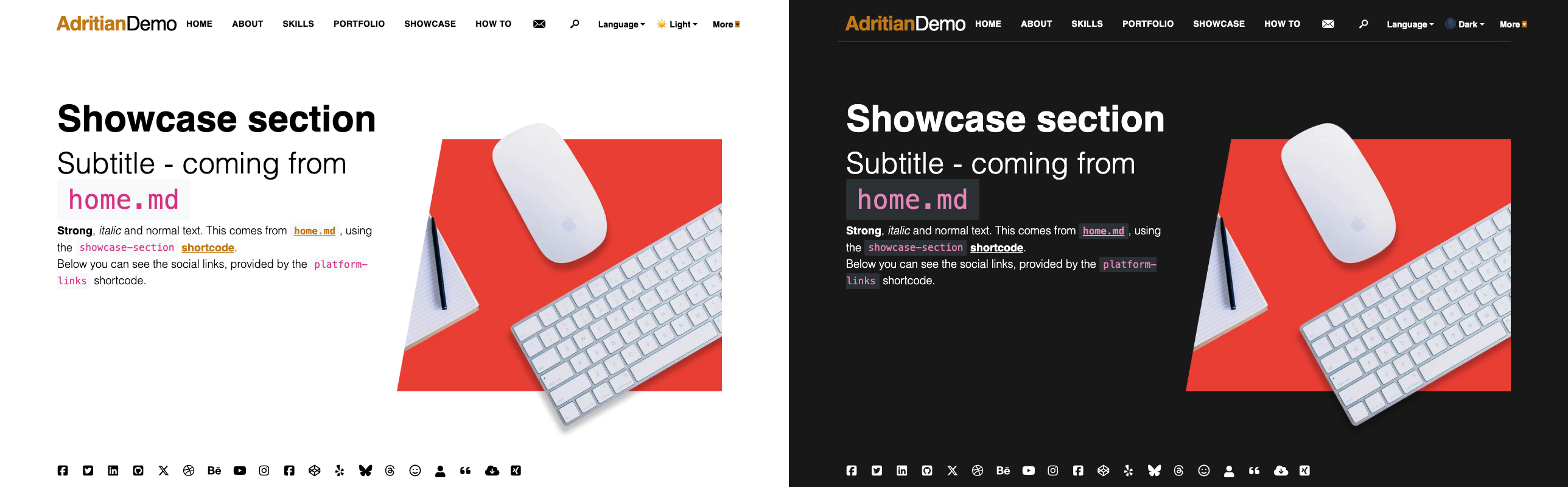
For each scheme below, the screenshot shows the same homepage hero in light mode (left) and dark mode (right), so you can see exactly how the accent color reads against both backgrounds.
Default
The original teal palette the theme ships with.
| Mode | Color |
|---|---|
| Light | #478079 |
| Dark | #66b2a9 |
Ocean
Deep blues and bright teals — well-suited to technology and developer portfolios.
| Mode | Color |
|---|---|
| Light | #1a6b8a |
| Dark | #4db8d4 |
Forest
Earthy greens for a natural, calm aesthetic.
| Mode | Color |
|---|---|
| Light | #2d7a3f |
| Dark | #5cb85c |
Rose
Warm pinks and reds — great for creative, fashion, or lifestyle sites.
| Mode | Color |
|---|---|
| Light | #b5495b |
| Dark | #e07689 |
Slate
Neutral blue-greys for a professional, understated look.
| Mode | Color |
|---|---|
| Light | #546e7a |
| Dark | #90a4ae |
Midnight
Deep indigo with violet highlights — striking in dark mode.
| Mode | Color |
|---|---|
| Light | #3f3d99 |
| Dark | #7c7ae6 |
Warm
Ambers and burnt oranges — ideal for food, travel, or personal branding.
| Mode | Color |
|---|---|
| Light | #c17817 |
| Dark | #e8a94f |
How to set a scheme
Option 1 — Pick a named scheme (simplest)
Add one line to your hugo.toml:
[params]
colorScheme = "ocean"  # default | ocean | forest | rose | slate | midnight | warm
Hugo compiles the colors into the CSS at build time. No JavaScript or extra files are added.
Option 2 — Use your own brand color
If none of the built-in schemes match your palette, set the colors directly — no data file needed:
[params.primaryColor]
light = "#c0392b"  # your brand primary
dark  = "#e74c3c"  # brighter for dark mode (optional — falls back to light value)
params.primaryColor takes precedence over colorScheme when both are set.
Option 3 — Add a custom named scheme
Add data/colorSchemes.yaml in your Hugo site (Hugo merges it with the theme’s file):
mybrand:
  name: "My Brand"
  light: "#c0392b"
  dark:  "#e74c3c"
Then reference it:
[params]
colorScheme = "mybrand"
This also makes your scheme available in the live switcher dropdown.
Live switcher
The live switcher lets visitors flip between schemes instantly, without rebuilding the site. The selection is saved in localStorage and restored on the next visit.
[params.colorSchemeSwitcher]
enable = true
This adds a dropdown to both the header and the footer. You can suppress either:
[params.colorSchemeSwitcher.selector.disable]
header = false
footer = true   # hide in footer, show only in header
Useful during development too. Even if you don’t ship the switcher to visitors, enabling it while you work lets you preview every scheme against your actual content — profile photo, project thumbnails, blog posts — without editing
hugo.tomland restarting the server each time. Once you’ve settled on a color, setcolorSchemeand disable the switcher.
You can also embed the picker inline on any page or post with a shortcode:
{{< color-scheme-selector >}}What the scheme affects
Every scheme token is injected into the compiled SCSS as $base-color (light) and $dark-primary (dark), so the change propagates automatically to:
- Navigation link hover and active states
- Body links and hover colors
- Tags and badge backgrounds
- Button outlines and fills
- Skill-bar fill color
- Focus rings (keyboard navigation)
- Reading progress bar
- Blockquote border accents
<mark>highlight backgrounds
Dark mode colors are handled separately — the theme applies the dark variant whenever [data-bs-theme="dark"] is active, so contrast is preserved in both modes without any extra configuration.